If you were invited to a police lineup of these yellows and asked which is accused of giving the most energy and joy whilst being divisive and possibly the last to be invited to the party (or the first even- see, divisive!), you would more than likely pick the middle yellow, and this is the subject bright yellow of this blog with some straying here and there into the surrounding shades.
This first Studio En blog was formulated in the dark of winter and teased out by the bright yellow Forsythia shrubs that erupt early spring along with the daffodils and tulips.
The title alludes to an essay on traditional Japanese aesthetics by Jun’ichiro Tanizaki called “In Praise of Shadows” from 1933 and will be repeated across blogs to follow to encourage such extended meditations as I explore themes that attach to a journey through art and architecture.
The Penguin Dictionary of Symbols describes yellow as the “most burning of all colours in its intensity, violence and almost strident shrillness”. It is interesting to consider where those qualities are best unleashed, or constrained and tempered, and how comfortably bright yellow sits in the urban environment, or whether it should remain a private passion and kept to the interior.
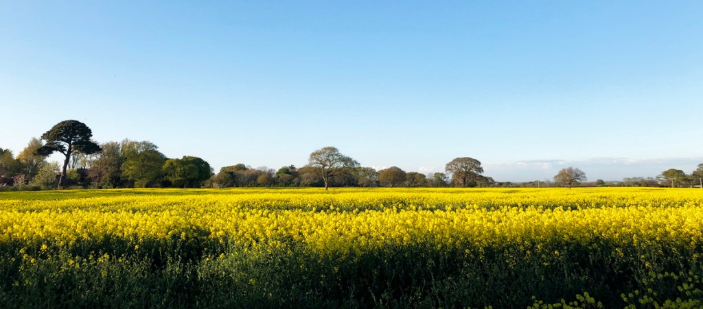
The bright yellow in nature has been amply displayed this Spring, with Rapeseed flowers igniting the countryside with the largest expanses of bright yellow to be seen. However, the route to really seeing and understanding colour is through the medium of art.
The immediacy of the bright colours of German painter Franz Marc from “The Blue Rider” movement experienced as a teenager in the Lenbachhaus Museum in Munich, such as “Tiger” painted in 1912, gave a jolt to the senses and a new focus.
The colours in the painting strive for their own identity and were highly imbued at that time with significance and spiritual values. However, the painting may also say something about the separating forces at work across the world, Europe and in German society as the country drew towards The Great War in 1914 in which Marc was to lose his life.
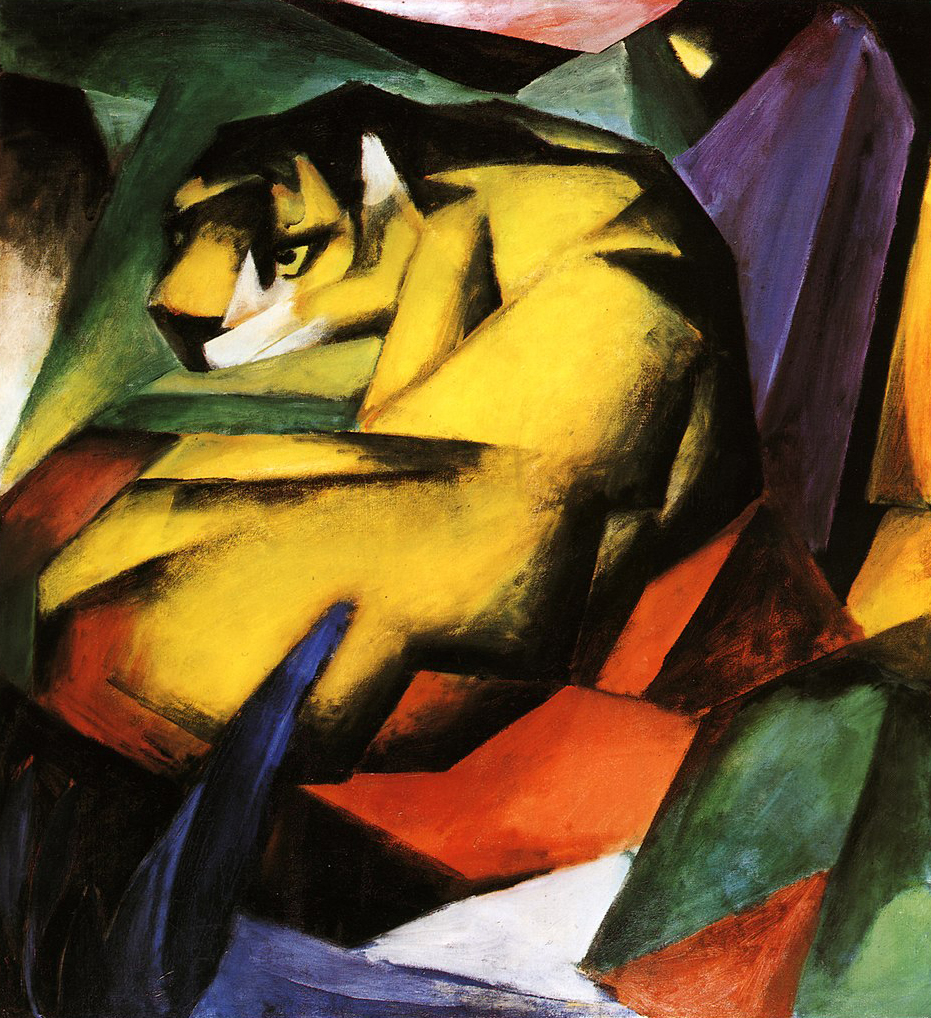
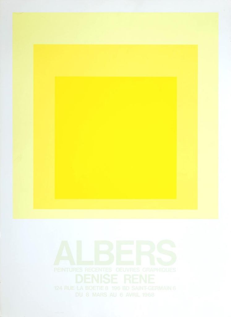
Where Franz Marc’s “Tiger” sees the dissolution of organic forms into angular blocks through the influence of Cubism and Futurism, the German artist Josef Albers’ abstract “Homage to the Square” paintings from 1950 to 1976 see the process of the individualising of colour that we are interested in here through another step.
Albers explored the layering of squares in different colour combinations, with many yellow square variations. The painting used for the poster of a 1968 exhibition at the Galerie Denise René is one of the brightest I have seen in his series with possibly the most intense radiation of energy I’ve seen in any painting, simulated purely by paint alone.
It is alluring but almost too intense, much like the bright dazzle of a lightbulb with the receding squares amplifying the bright yellow’s intensity, the result of a lot of experimentation.
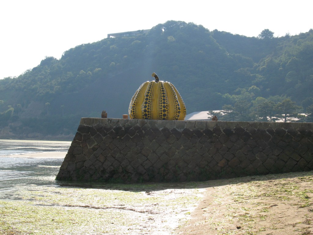
“Pumpkin” by Japanese artist Yoyoi Kusama is a two metres high sculpture isolated away at the end of a pier on Naoshima island in Japan since 1994, and is understood to be a self-portrait of Kusama herself and has become as iconic as its creator.
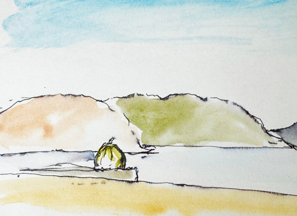
As you draw near, the bright colour and form becomes embracing, and the receding black polka dots in Op Art fashion hold the form together and make it joyfully quiver but with a slight, threatening ambiguity.
Kusama’s art acts as an escape from very vivid traumatic childhood memories. Japanese Pumpkin (kabocha) is actually green and knobbly on the outside but golden yellow on the inside, and is one of Japan’s favourite roasted culinary delights. It could be imagined that escape into the yellow flesh of the pumpkin were transcendent moments that eventually translated into this work.
Through its welcoming polka dots “Pumpkin” eludes the warning sign in nature from yellow and black stripes, Marc’s tiger being orange in reality, but the wasp providing as good a reason to be weary of this colour combination, and as good as any reason to have an aversion to bright yellow.
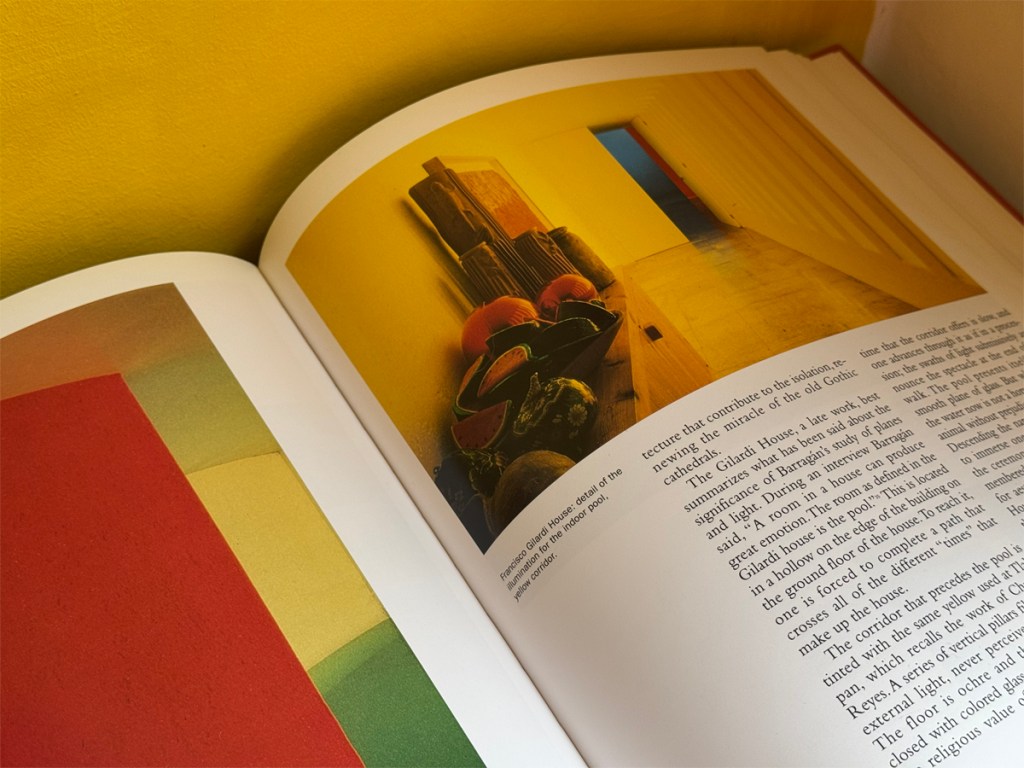
Primed particularly by the bright colours of Franz Marc and his fellow Blue Riders, the work of Mexican architect Luis Barragán was immediately seductive as an architecture student and there is one particular project that remains totemic for Studio En: the Gilardi House (1976), located in Mexico City.
Already retired, this was Barragán’s final project and similar to Marc, the yellow relates to his spiritual beliefs.
One of the signature spaces is a corridor with walls and ceiling painted a bright yellow. It is lit from a courtyard through a series of slot openings with frameless glass coloured the same yellow hue to make the yellow light untainted with sunlight and views to the pink and violet walls in the courtyard. It leads to the inner sanctum of the dwelling with a pool, blue-painted walls, and a single red wall rising from the water and catching the blades of sunlight that enters through high windows.
The bright yellow corridor recalls the work of American light artists from the previous decade- James Turrell and Dan Flavin, for example- and their intallations with light as one isolated colour, and the treatment of this passage succeeds in creating a total dedication and homage to the colour.
When I was asked to talk to children in an inner city Sheffield school about being an architect I just showed the work of Barragán and it really connected.
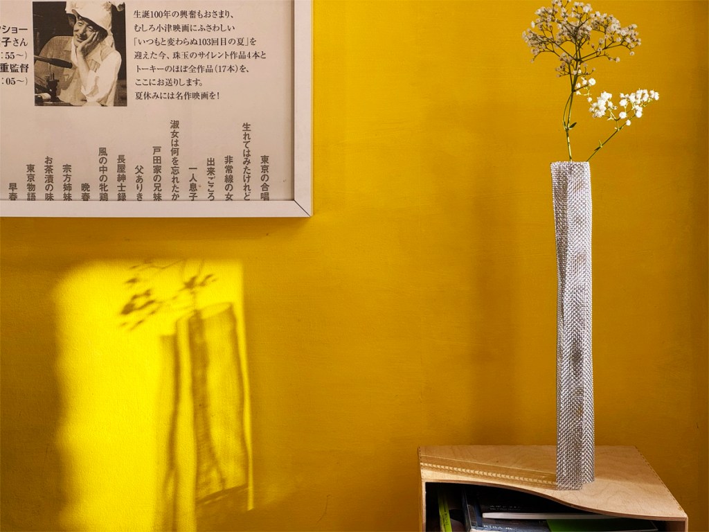
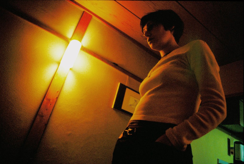
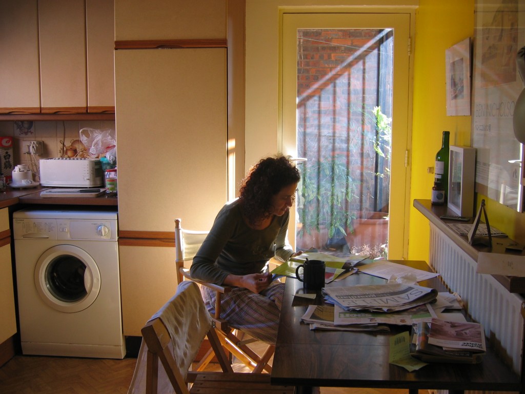
Strongly under the influence of the Gilardi House, a bright yellow painted wall has followed us across four of our own dwellings, starting with the single yellow wall in the kitchen of our small townhouse in Kyoto, Japan.
The gesture was shocking for our landlord as Japanese houses generally have a very muted decor with fine textured walls, and it was here that I learned about what Expressionist and Blue Rider artist Wassil Kandinsky described as the “very strong kinship” between yellow and white.
The image below is the only evidence, looking slightly green in the background but deliriously bright in reality. The typical walls are seen in the foreground, and the wall lighting by myself saved another situation about which Tanizaki has much to say in his essay.
That configuration- one bright yellow wall, the rest of the room white- was carried back to a flat in London- an immediate warm and embracing welcome to everyone who passed through from around the world and sometimes stayed. The wall then moved on to two houses in Sheffield.
The painted wall is a key focal point in each home and is enveloping, uplifting, and quite alive, with many characters depending on the light. Test swatches helped to determine the correct hue and saturation to prevent it being too light so that the energy doesn’t dip, or too orangey or mustardy so that it doesn’t starts to get weighty or without character.
It is a treacherous road and the slightest tinge of green and it starts to look sickly. The true desired colour comes out best when the wall is ignited by sunlight, and makes the room glow with warm reflected light.

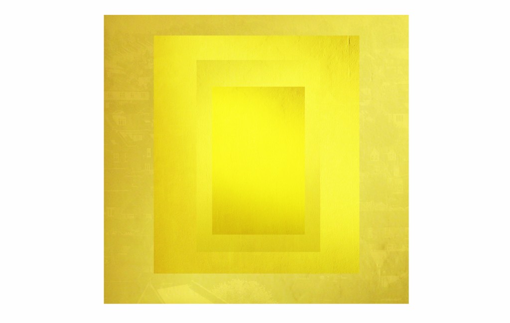
The singular nature and character of the wall was here manipulated into an image (after Josef Albers) complete with flaws as a going away present for close friends returning to Germany.
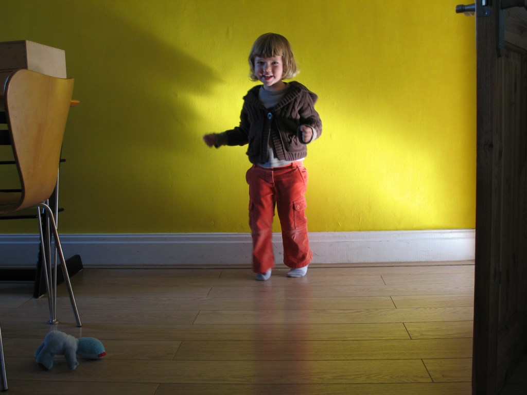
The second image shows the family home with all walls in the kitchen-diner yellow which is uplifting and cheerful, and a busman’s holiday for me in judging how much it misses the interplay with white.
This next part is going to divide you as bright yellow does, but don’t worry, unlike conservation areas it is a story of impermanence and the yellow was short-lived and no longer there.
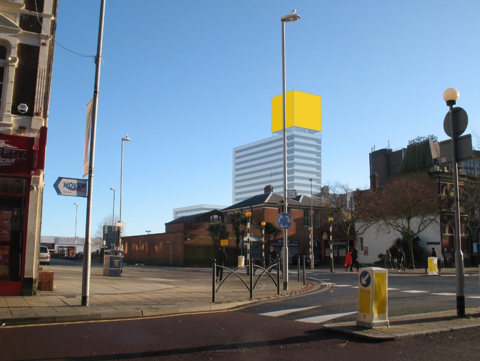
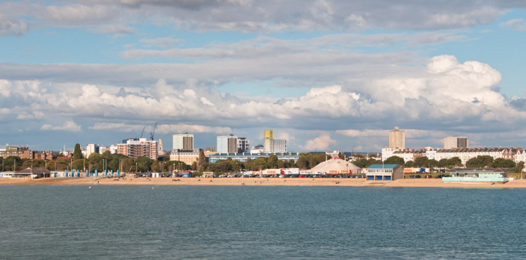
Whilst working for Cooley Architects we proposed the five-storey bright yellow cube to crown a 25-storey student residence tower in Portsmouth, the seaside location making it feel like this was the right moment for such a bright, sun, sea and sky-related gesture, and a striking contrast to the sombre skyline of the London from which the train below had travelled.
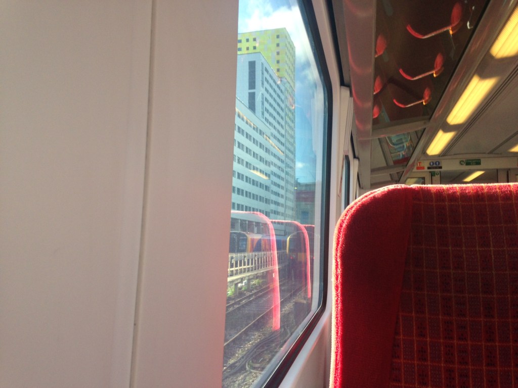
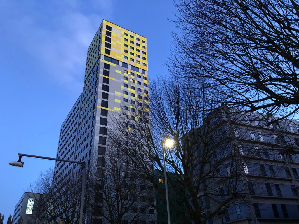
The cube concept came first and fixed the upper lounge with its 360 degree view and deserved separate treatment from the rest of the building. Very briefly it was black and then swung to the opposite pole, bright yellow, which went on to make it a great navigation aid for ships and yachts entering the harbour.
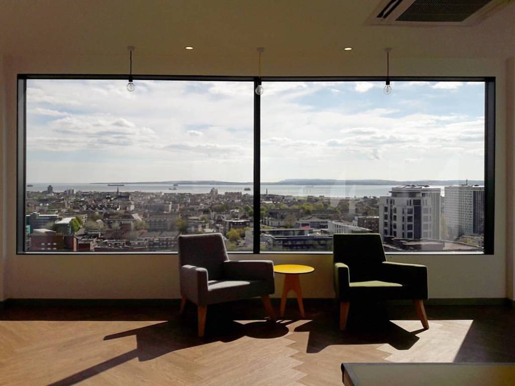
How it was received by the residents after completion by another office of architects, who also dealt with the recladding of the building, still remains to be discovered through oral histories of the bright yellow cube, 2017-2025.
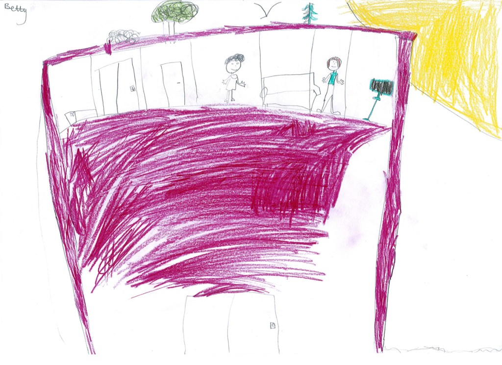
At the end of the planning design phase, it was presented to the public and provoked one particularly strong response from a vocal activist whose comments were interpreted vividly by a 9 year old.
The building went on to be awarded for Best Building of the Year from the Portsmouth Society.

It was a one-off and particular to a place, but what about examples of the successful large-scale corporate use of bright yellow for buildings?
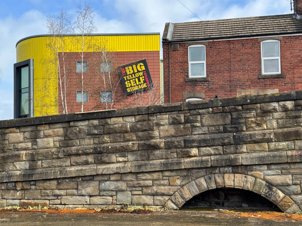
The Big Yellow Self Storage facilities are one of the best examples. It is a clever ruse where the building becomes the sign, and the use of the brightest of attention-seeking colours is justified by the name written clearly for all, in bright yellow of course.
Psychologically, I think it was an inspired choice, making the complex emotional spectrum behind the need for storage as cheerful and energising as possible, following through to the bright yellow doors lining the white internal corridors lit only by strip lighting. You deposit or retrieve, or pause to look at something, and the bright yellow keeps the experience bright and light.
And impossible to forget the worldwide retailer and regional-identity-transcending phenomenon that is IKEA, with stores around the world seeing the thorough use for all elements in deep blue and bright yellow- the colours of the Swedish flag- so that on approaching a store the building consumes you in great fields of uplifting and transporting colour preparing for the heightened art of joyous consumption within.
After IKEA Tokyo Bay opened in 2006, it became one of the most visited attractions in Tokyo, second only to Tokyo Disneyland, and attraction is the right word!
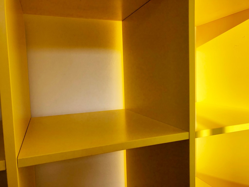
Around ten years ago IKEA did a brilliant, soaring climb out of blacks and whites and wood veneers with the bright yellow Kallax shelving unit whose intensity of colour was unwavering, appearing as if carved from solid yellow. It simmers in the shadows and then ignites when touched by sunlight.
And it helps me imagine a visit to the Gilardi House.

To round off, let’s look at three local examples of bright yellow use in Sheffield’s urban environment in order to show more individual and nestled commercial usage.
The Sheffield Makers shop contains local crafts and art and the continuous painted surfaces that fold into the deeply recessed door and make it hard to resist the clichéd busy bee being drawn into a solitary wildflower. It seems so appropriate as a representation of the handcrafted industry within that expresses joy through making.
It definitely adds a solid block of cheer to this junction, harmonising also with the yellow of the stone.
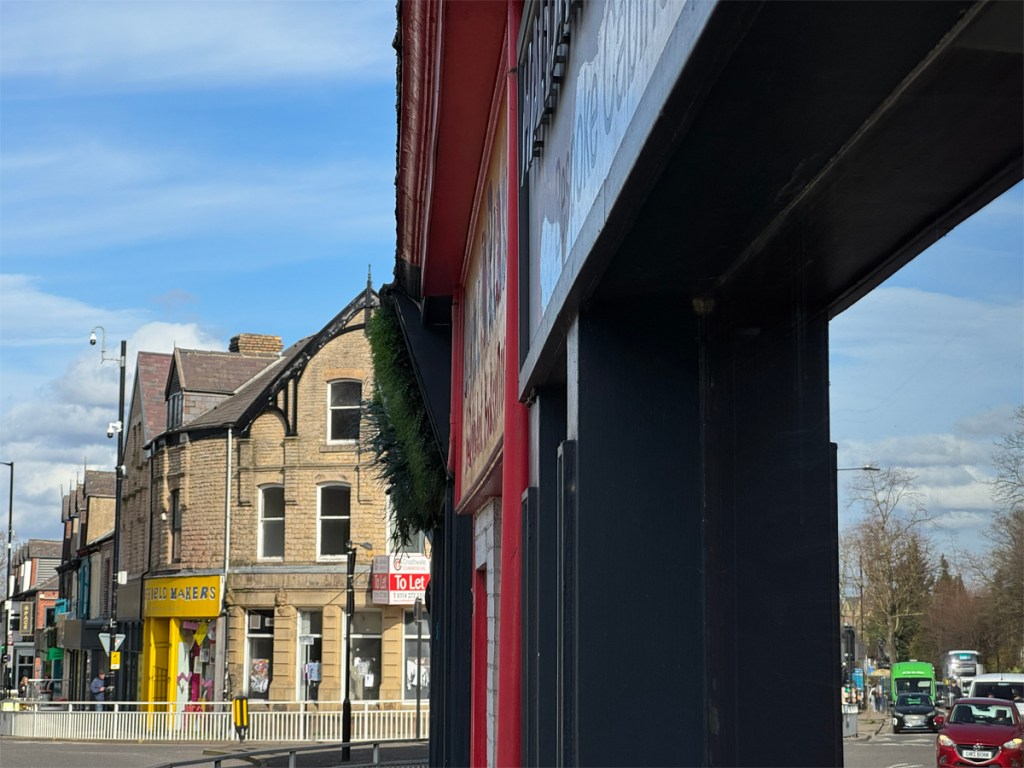

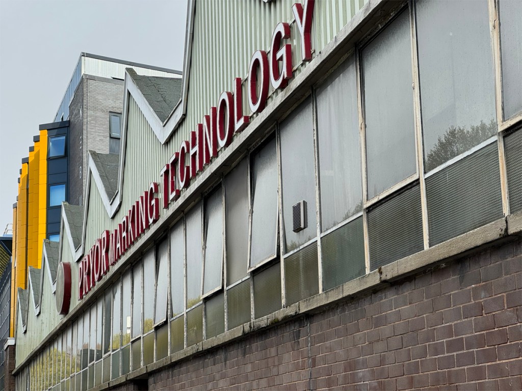
The cladding to these stacked projecting windows on this student residence on the Sheffield ring road nudges the yellow too close to that of traffic bollards. That particular yellow, almost orange, is overtly, eye-catchingly visible and utilised mainly for traffic signs, and thus best remains as small punchy punctuation marks in the urban syntax.
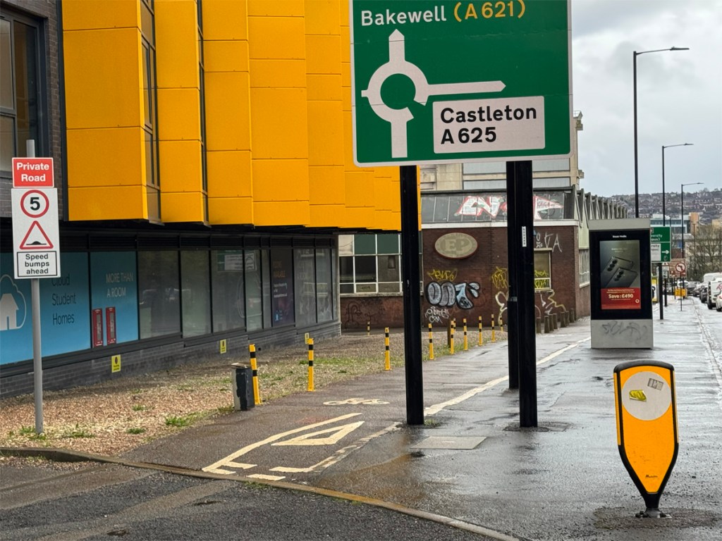
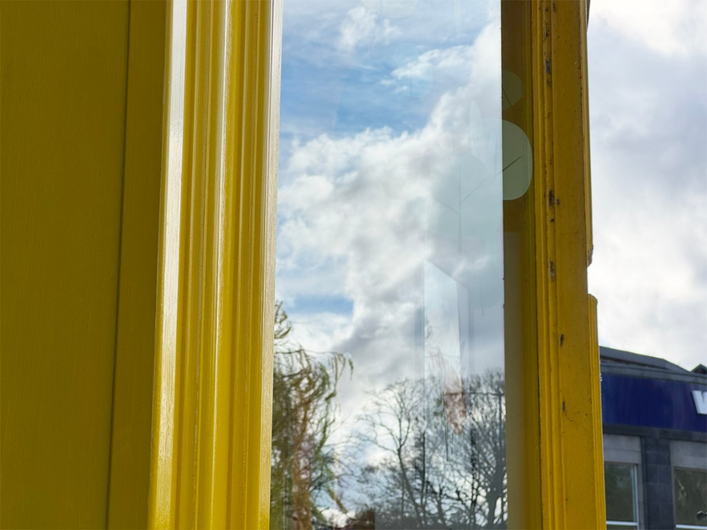
And finally in this overview of bright yellow usage, there is an office complex in Sheffield which through its yellow window frames alone remains an injection of joy, energy and excitement every time it is passed.
The colour is spot on bright yellow, and a rather unexciting and incongruous set of buildings have been given a character and warmth regardless of the weather, and the bright yellow fizzles away representing its finest characteristics without imposing itself on the setting, and through this modest yet bold act makes it one of my favourite architectural gestures in the city.


So, is bright yellow an acid squirt in the eye and the shrill falsetto to blue’s calm mellow tones? Or a serenade with sunshine through a coloured pencil or felt tip pen?
When we come out of winter, bright yellow’s intensity strikes at that time when darkness is lifting and the day’s length leaps and the sun is warming, all conspiring to heighten the excitement of Spring.
All of that emotion, thrill and optimism is maybe contained in the psychology of bright yellow all year around, but as I’ve demonstrated, one person’s Spring is another person’s sting so be careful how you use.


Leave a comment