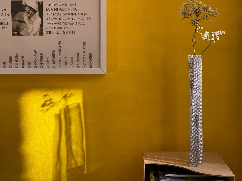
If you were invited to a police lineup of these yellows and asked which is guilty of delivering the most energy and joy, you would more than likely pick the middle yellow, and this is the subject bright yellow of this blog with some straying here and there into the surrounding yellows.
This first blog was formulated in the dark of winter and teased out by the bright yellow forsythia shrubs that erupt early spring along with the daffodils and tulips. The title alludes to an essay on traditional Japanese aesthetics by Jun’ichiro Tanizaki called “In Praise of Shadows” from 1933, and will be repeated across blogs to follow to encourage such extended meditations, as I explore themes that have attached to my journey through art and architecture. Images and text will attempt to balance each other in a yin-yang tumble of ideas and impressions.
During the COVID pandemic, I walked the streets of the nearby Nether Edge Conservation Area in Sheffield habitually scanning every house for every last detail. My general observation was about the absence of bright, saturated colours- those colours that are not restrained through the taint of black and white. Strolling through the same streets today a bright yellow front door announces polychromatic yearnings with a further handful of vibrant coloured doors seen on the route – pink, blues, and a red- all quite new in my eyes. The effect of these coloured doors is to excite the visual field, and there are, in any case, brightly coloured cars in front of the houses. The colours are all well chosen and a welcome counterpoint to the unarguably attractive visual harmony of the street scenes, muted and toned naturally. In a sense the life of the house, the spirit of the householder, erupts on to the street through bright colour.
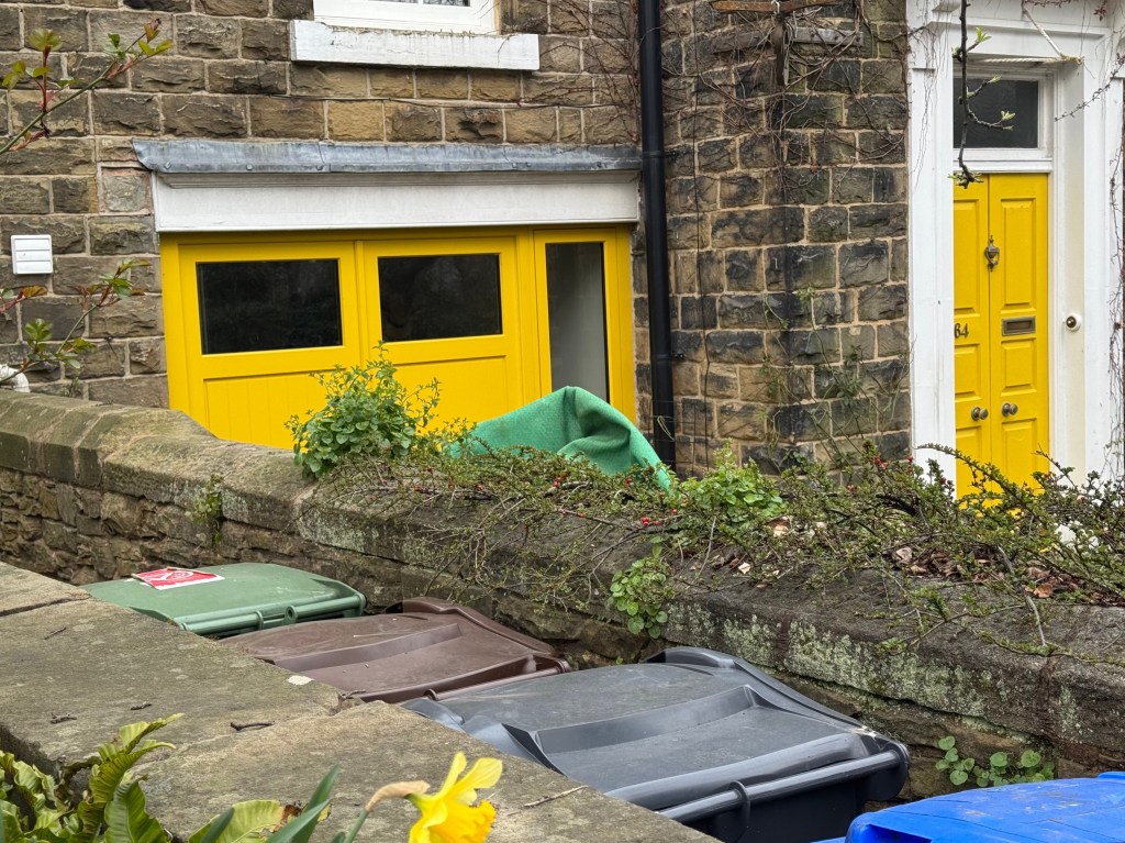
Conservation areas are governed by rules of appropriateness and protected by planning authorities. Large blocks of bright colour would most definitely be judged “not appropriate”. Changes to the external appearance of a house often requires an application.
In the use of bright colours….., A row of terrace housing can tow the line of convention until a bold household breaks rank and paints everything blue, as a local example, then suppressed desire for bright colour breaks loose and a single street becomes the vision of an Aegean hill village.
Blue is calming on the eyes and at least gives the house opposite a simulated hit of cloudless sky. Bright yellow might have been the felt tip of choice for almost every child depicting the sun in varying degrees of composure or exuberance, but a yellow painted house on a street are scribbled rays from the sky gone awry, and bright yellow remains contained and reserved for accents only.
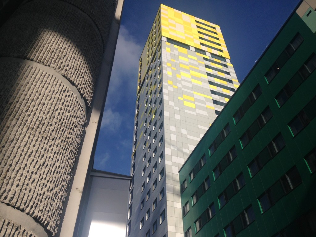
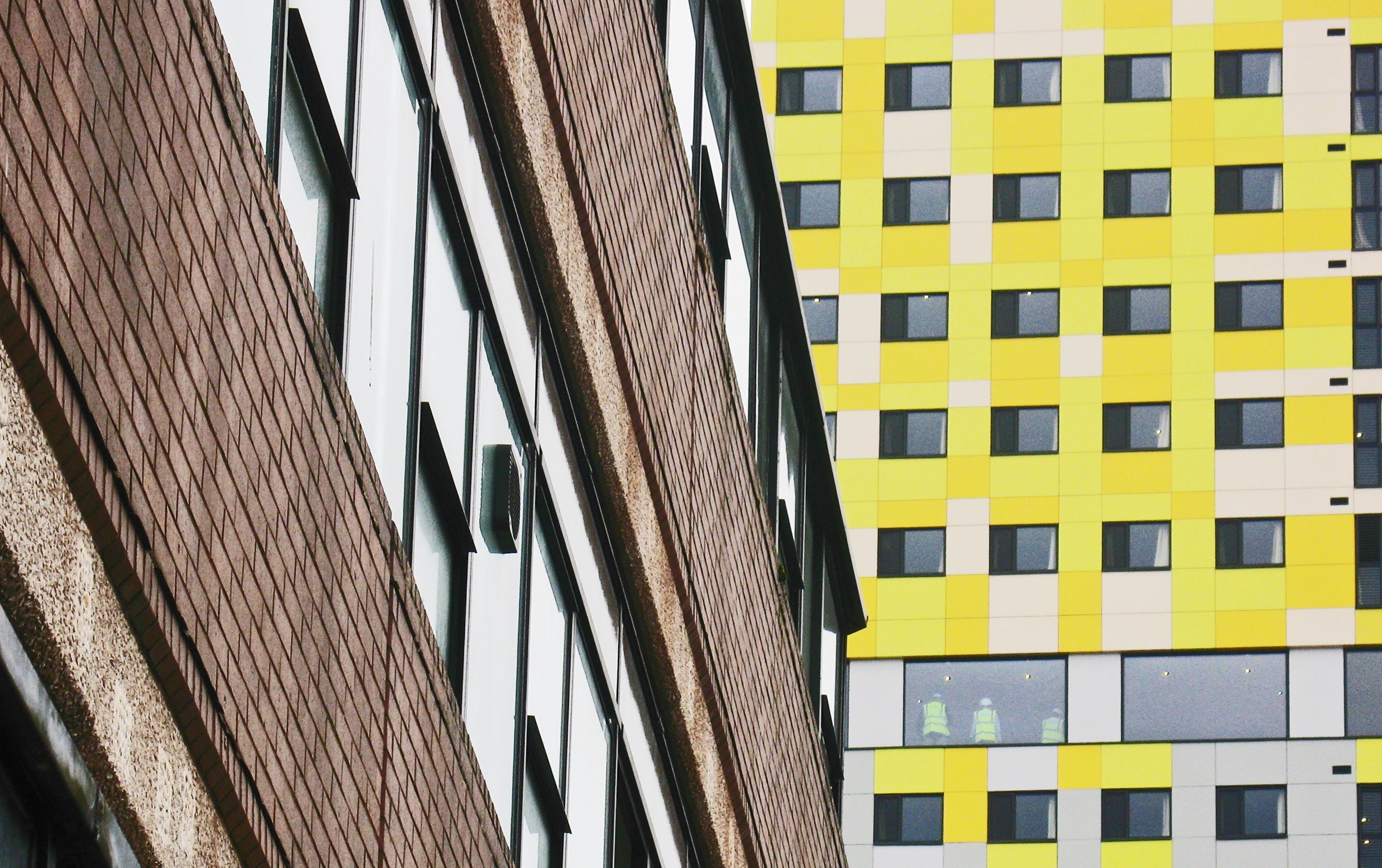
This next part is going to divide you as bright yellow does and for good reason, or more reasons than one, but don’t worry, unlike conservation areas, it is a story of impermanence.
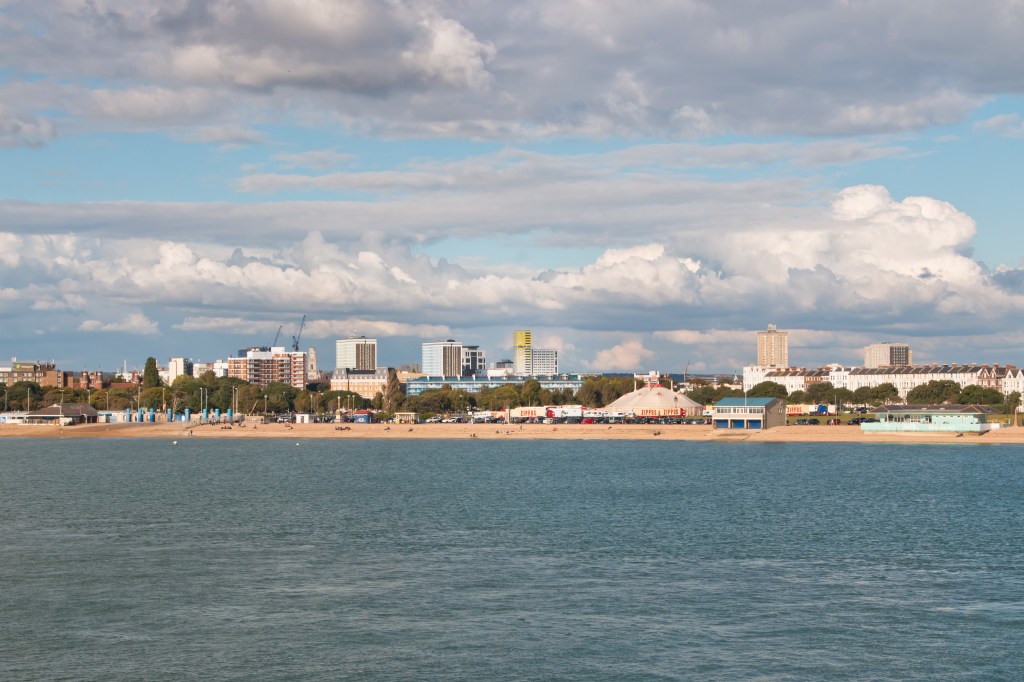
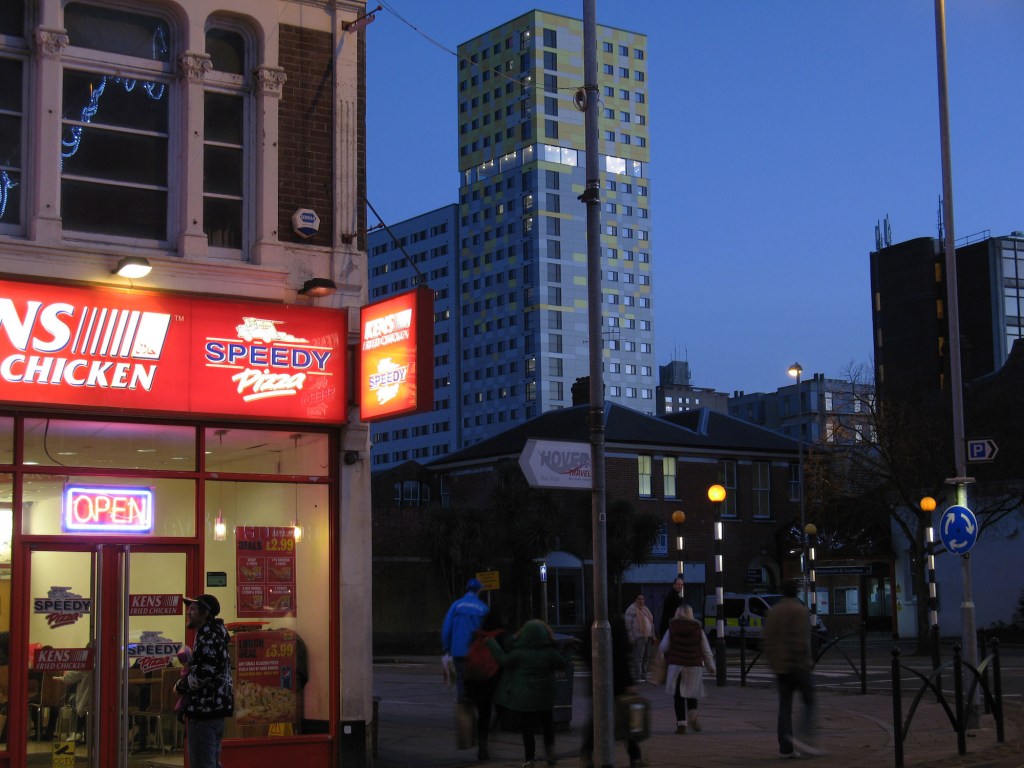
Whilst working for Cooley Architects we proposed the five-storey bright yellow cube to crown a 25-storey student residence tower in Portsmouth, the seaside location making it feel like the appropriate felt tip pen of choice. Both myself and the co-designer Ralph Cooley knew the city well and argued the yellow cube through architect panels and planning, immovable in our belief that this bold gesture was right for the city. It was a joyful and exuberant gesture. The sun would shine every day…until replaced by green and white panels, but not on our watch.

Leave a comment